Design & Visual Branding UI/UX Design Digital Marketing Video Production
Work
Contractors & EPC Developers All industries
About Careers Get in touch

Home / Work / Arthika

Case study — 2025

Where nature nurtures.

A natural skincare label that needed a look conveying purity, elegance and trust — on a shelf where every competitor claims exactly the same three things.

Client
Arthika
Sector
Natural skincare & wellness
Year
2025
Role
Branding & packaging

About the project

A philosophy that had to survive contact with a shelf.

Arthika is built on a simple idea: that nature and self-care belong together. The brief was brand identity and product packaging for a natural cosmetics line — but the real task was translating a philosophy into something that holds up at arm's length, in poor retail lighting, next to a dozen brands making identical promises.

Design constraints
  • Must read as premium without using the usual luxury shortcuts
  • Must survive small-format application on bottles and caps
  • Packaging had to be eco-conscious in material as well as in message
  • The system needed to extend to products not yet designed

Our approach

Philosophy first, then the mark.

01Understanding the philosophyWe began with the brand's own thinking — the link between nature and self-care — rather than with a moodboard. Everything downstream had to be traceable back to it.
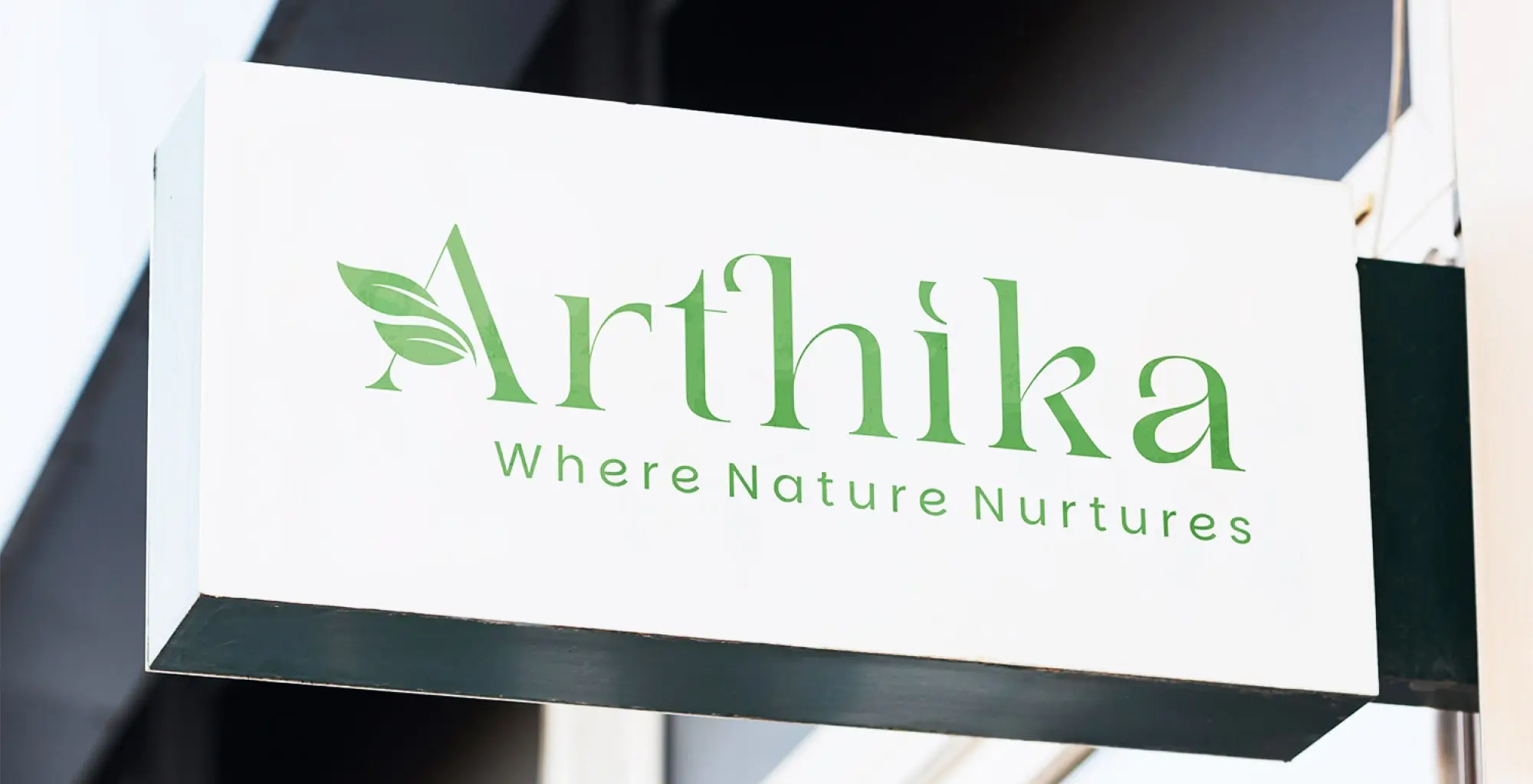
02Logo & identityA mark that is simple but meaningful, built on natural elements rendered in a modern style. Restraint was the point: the category is crowded with ornament.
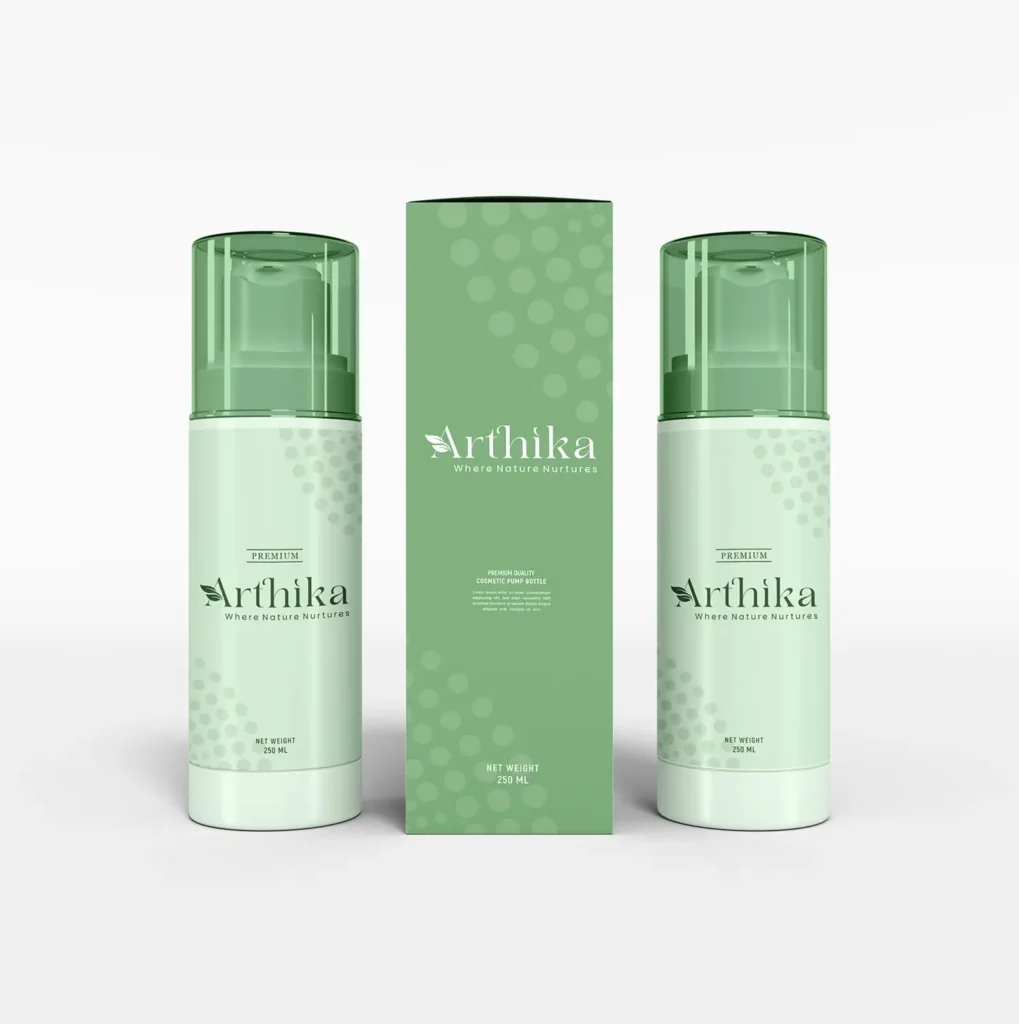
03Eco-conscious packagingBottle packaging designed for the product line, with material and finish choices that match the brand's claims rather than contradicting them.
04Colour, type & layoutA palette and typographic system chosen to convey calm, care and authenticity — and tested at the scale a cap and a label actually allow.
Brand identity
Brand identity
Product packaging
Product packaging
Packaging detail
Packaging detail

Conclusion

A premium, nature-based label with a system behind it.

The result is a cohesive and visually strong identity that positions Arthika as a premium natural cosmetics brand. The logo and packaging now set the tone for the brand's wider visual communication and market presence — which means the next product doesn't start from zero.

01

Coherent across touchpoints

One visual language running from the mark through packaging to the brand's wider communication.

02

Credible at shelf

Purity and elegance expressed through restraint rather than claimed in copy — which is what the category's buyers actually respond to.

03

Built to extend

A system rather than a single design, so new products slot into something that already exists.

Launching or redefining a brand?

Identity and packaging are cheapest to get right before the first production run. Tell us what you're making and when it ships.