
Consistent across projects
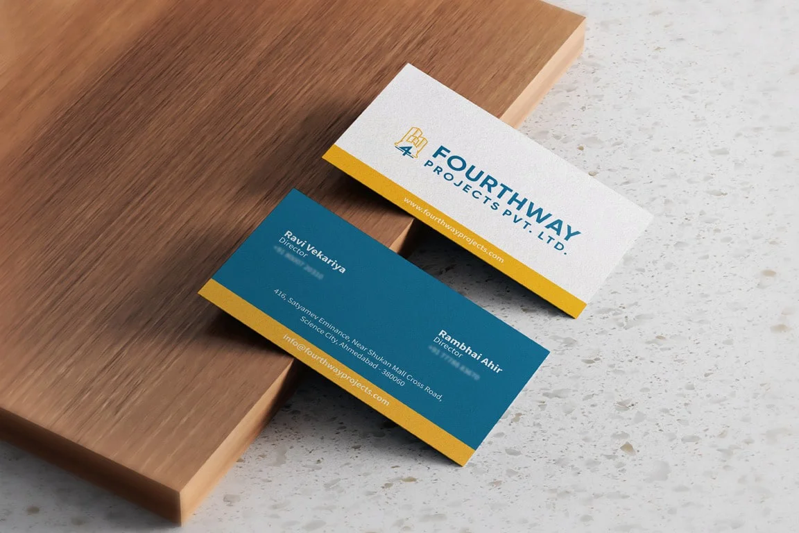
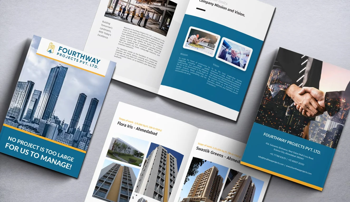
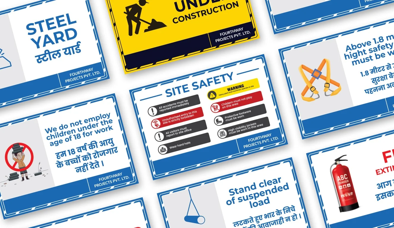
One visual standard applied to hoardings, brochures and digital, regardless of which team or supplier produces the piece.
Home / Work / Fourthway Projects
Case study — 2023
Several projects, several visual languages and no connecting identity. We built the system underneath, then applied it everywhere.
About the project
Buyers recognised the developments and not the developer behind them — which meant every launch started from zero instead of building on the last one. The task was to give the parent brand enough presence to carry equity forward, without flattening the character of the individual projects.
The challenge
No defined relationship between the group brand and the project brands.
Collateral produced project by project, by different suppliers, with no shared standard.
No usable master files — every new piece rebuilt from scratch.
Digital presence limited to project-level listings, with no group story anywhere.
Our solution
Conclusion
Every launch since has carried the parent brand at the same weight, which means recognition accumulates instead of resetting. Internally, the templates removed a recurring bottleneck — routine collateral no longer waits on a design queue.
One visual standard applied to hoardings, brochures and digital, regardless of which team or supplier produces the piece.
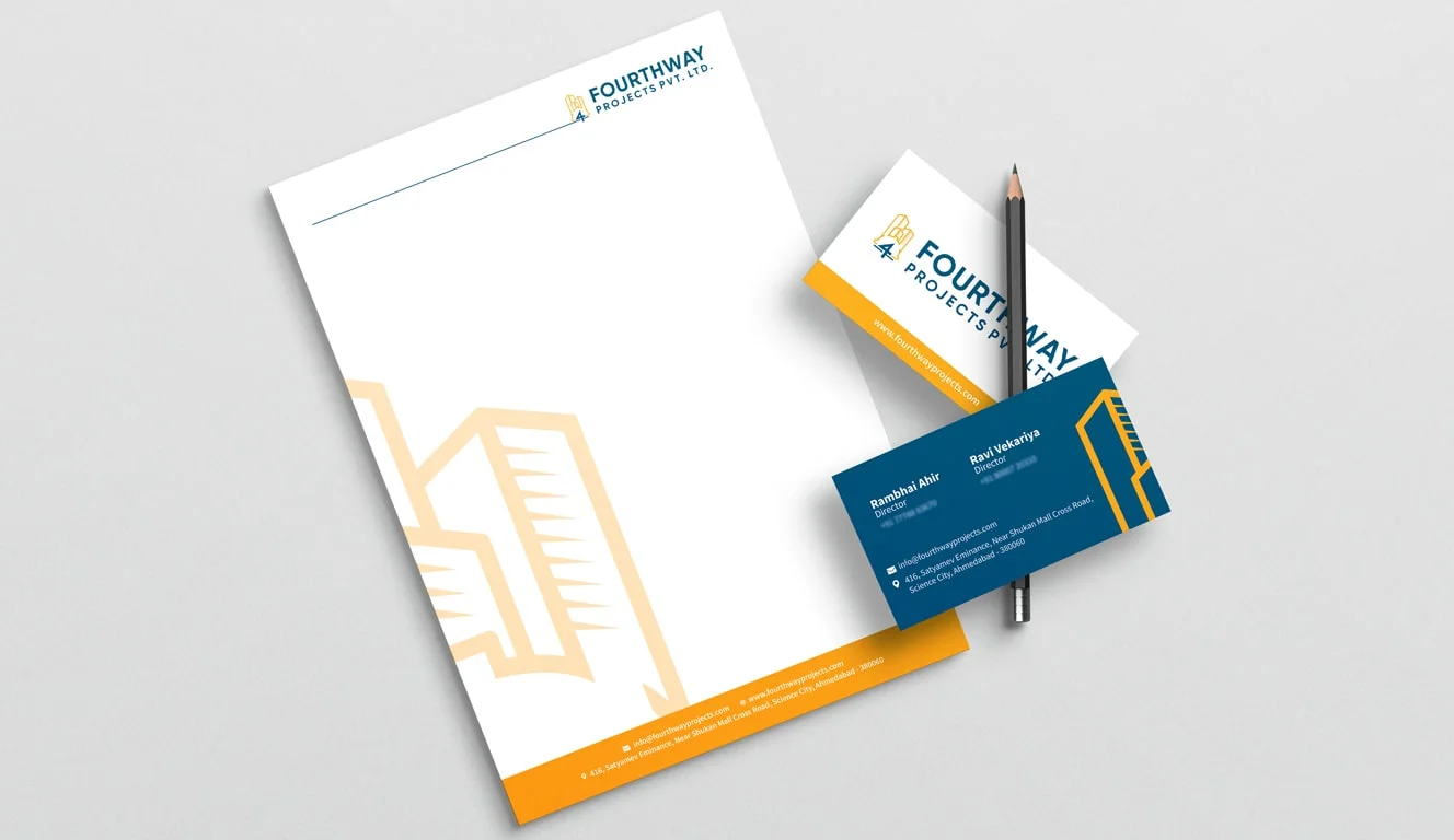
Master files and templates mean routine documents are produced internally in hours rather than commissioned in weeks.
The architecture accommodates new projects without a redesign — the next launch slots into a system that already exists.
More work
Brand architecture is one of the cheapest fixes with the longest payback. Usually a four to six week piece of work.